Spreadsheet.com is shutting down on May 31st. Read more ...

Managing a sales pipeline can be complex, and without a robust set of CRM tools in your belt it can quickly become unmanageable. Collecting and tracking data is only part of the story, and visualizing that data and communicating it with others is equally important.
With their modular grid of widgets, support for including information from multiple workbooks, and flexible sharing options, Dashboards are a great complement to traditional CRM spreadsheets. In this Guide, we’ll take a look at a sample CRM Dashboard that can be shared with a sales team and managers or executives.
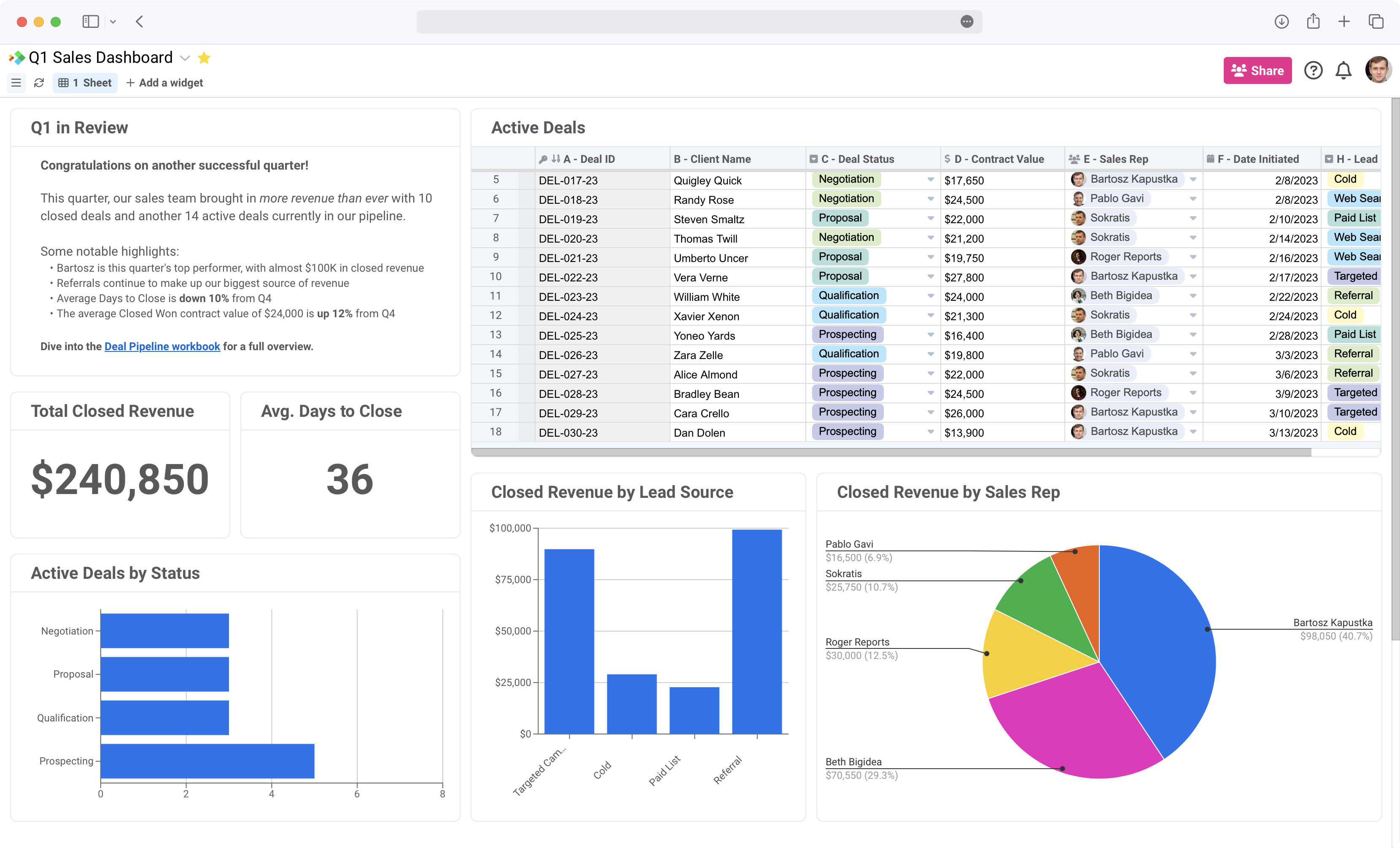
Data and visualizations alone can convey a lot of information, but sometimes you need words to complete the picture. Rich Text widgets let you include text with bullet points and numbered lists, code snippets, heading formatting, hyperlinks, and more.
Here, we’re using a Rich Text widget to send a message to the sales team, summarize some key takeaways, and include a link to another Spreadsheet.com workbook with more information. You may also want to use a Rich Text widget as a Read Me message that explains the dashboard, a list of key personnel and their contact information, or to tell the story of your data.
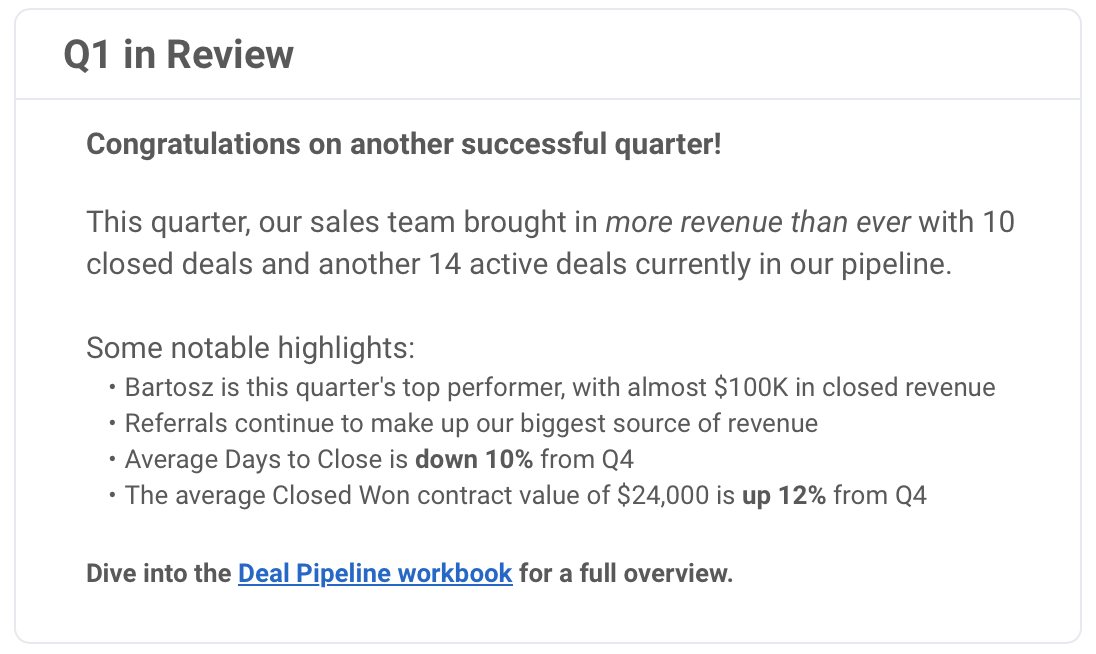
View widgets let you embed a View from a connected Spreadsheet.com workbook in your Dashboard. They’re a great way to include raw data in your Dashboards without asking viewers to dive into a larger or more complex workbook, and for managing access to that data.
Here, our Dashboard includes an embedded Sheet View with a list of active deals from a larger CRM workbook. A similar widget might include a View of closed deals or deals in a specific pipeline stage. With the Reports widget, Dashboards also support embedded Reports, allowing you to feature data that’s collected from multiple workbooks.
Adding Number widgets to your Dashboards helps you highlight significant figures and important statistics, making it easier for viewers to see the big picture. These numbers can come from any connected worksheet and can be formatted to your needs.
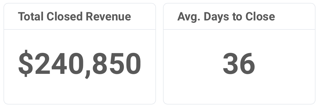
In our Dashboard, we’re using Number widgets to highlight two important takeaways from our pipeline – the total closed revenue and the average time for deals to close. You may want to include numbers like the total number of deals closed, the average contract value of signed deals, or the percentage of deals that ended as Closed Won.
Dashboards support the same dozen-plus Chart types that you can include in your Spreadsheet.com workbooks. Charts help viewers visualize and analyze raw data, and complement Number widgets and embedded Views and Reports that are also included in a Dashboard.
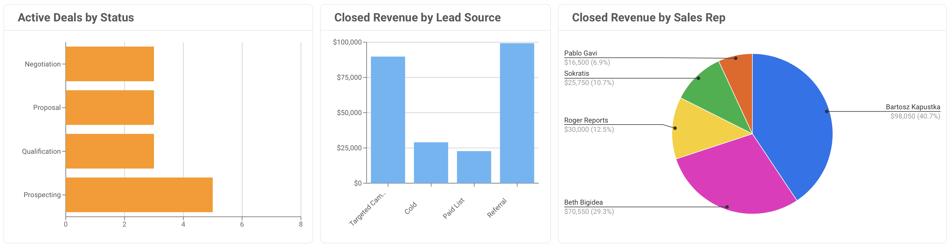
Our Dashboard features a combination of Pie, Column, and Bar charts with different information about our deal pipeline. Learn more about the different types of charts supported by Spreadsheet.com in our Help Center.
Learn more about creating and configuring Dashboards in our Help Center, and start creating your own with a free Spreadsheet.com account today.